 Fuck Each Other Not The Planet Unisex
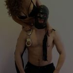 Wear My Kink
Pattern Branding: Decorative
Pattern branding is all about decorative repetition that coats your presence in a vibe you can feel in your bones. When your feed looks like a cohesive artwork not a random collage you earn trust faster. For the deeper map of branding on OnlyFans check out the main guide here: Best Branding OnlyFans. This article shows you how to translate decorative patterns into a living brand not a pretty mood board. If you want a brand that feels tactile and unmistakable you are in the right place. We will walk you through how to design a pattern system that supports your content strategy and makes fans return for more.
What decorative pattern branding is and why it matters
Decorative pattern branding uses repeating motifs, textures and color play to create a recognizable visual language. Think about a wallpaper that hints at the vibe of every shot in your feed. The pattern becomes the invisible frame that guides attention and conveys personality before a single word is spoken. For creators in the kink and fetish space pattern branding matters because it helps your audience instantly recognize your work among the noise. Patterns are not just pretty they act as cue systems that tell fans what to expect. A well designed pattern library makes your posts look like they belong together even when you are experimenting with new formats.
Pattern language and motifs
A pattern language is a family of motifs and textures that share a common DNA. Motifs can be geometric shapes like diamonds and honeycombs or organic shapes inspired by lace, damask, leather grain or rope textures. The key is coherence. When you mix patterns you want a unifying thread such as a recurring shape, a consistent line weight or a signature color. You want your audience to say I know this is theirs even if the content shifts from one scene to another. A sharp pattern language elevates personality without shouting for attention.
Pattern scales and hierarchy
Patterns work at different scales. A petite repeating motif can support icons and overlays while bold large scale patterns can ground headers and cover art. Establish a hierarchy so fans see your brand in the first glance and then focus on the message. You might use a bold pattern as a page background for video intros and a subtle variation for thumbnail borders. The contrast keeps things fresh while preserving a core identity.
Creating a sturdy pattern system
A pattern system is a toolkit not a one off design. It should be documented and stored so anyone on your team can reproduce the look. Here is a practical approach you can start today.
Step 1 define your core mood
Your mood is the emotional compass for your patterns. Are you playful and cheeky or dark and authoritative. Do you lean into glamour or a streetwear edge. Write a short mood brief that lists three adjectives and a few example visuals. This becomes the north star that guides every pattern choice including color and texture.
Step 2 select core motifs
Choose two to four motifs that will anchor your brand. Examples include a lace inspired loop, a rope weave pattern, a geometric grid, or a floral silhouette. The motifs should be distinctive but not busy so they scale well across thumbnails video overlays and banners. Decide how each motif will be used across assets. One motif might appear as a background texture while another acts as a border or corner mark.
Step 3 build a pattern library
Create a library of patterns with documented usage rules. Include patterns at multiple scales color variations and opacity levels. For each pattern note the preferred color palette the recommended background pairing and the contexts where it should appear. A small library that fits on a couple of slides in a branding deck is enough to start. You can expand it later as your content library grows.
Applying pattern branding across assets
Pattern driven visuals should inform every asset you publish. Here are practical applications for the decorative approach and tips to keep it consistent across different formats.
Thumbnails and cover art
Thumbnails are the first impression fans see. Use a consistent pattern frame behind your subject and a controlled color wash to unify thumbnails across the grid. Consider a lightweight pattern border that highlights your subject without overpowering it. A consistent treatment for cover art helps fans instantly recognize your posts in crowded feeds.
Video intros and lower thirds
In video openers weave a subtle pattern behind the title and incorporate a small logo lock up. Lower thirds can use a faint pattern strip at the edge of the frame to reinforce the branding without distracting from the spoken content. Patterns in motion should be gentle and not clash with speech or heavy sound design.
Profile banners and avatar frames
Profile visuals benefit from a strong but restrained pattern. Use a single motif as a background and pair it with a clean type lock up for your name. This keeps your profile instantly recognizable when fans glide through posts and live streams.
Typography and color interplay with patterns
Patterns live with typography and color the way a chorus lives with a lead singer. The right combination makes the brand feel cohesive not chaotic. Here is a quick guide to pairing typography with pattern to maximize readability and impact.
Typeface pairing
Choose a strong display type for headings and a readable sans serif or serif for body copy. The type should feel aligned with the mood you defined in step one. Avoid overly complicated typography that competes with your patterns. Clear legibility is essential especially for thumbnails and promo banners.
Color palette and contrast
A decorative pattern thrives when the color palette is tight. Start with a main color and two to three supporting shades. Use lighter tints or darker overlays to create depth. Maintain sufficient contrast between type and background so messages are legible on mobile screens where most fans browse.
Patterns in photography and video workflows
A pattern approach should flow through your shooting and editing pipeline. Here is how to weave patterns into the actual production process without slowing you down.
Backgrounds and set design
Create a small set of patterned backdrops or textures that can be swapped quickly. A patterned rug a fabric wall or a wall panel with repeating motifs can anchor scenes and give you a signature look. The goal is to add visual interest without stealing focus from the performer and the action.
Overlays and titles
Overlays with selected patterns can give your clip titles a premium feel. Keep overlays minimal with limited color and low opacity so text remains readable. Pattern overlays work well when they subtly change with the scene for continuity across clips.
Lighting and texture interaction
Patterns respond to light differently. A glossy pattern catches highlights in a unique way while a matte texture reads as soft and intimate. Consider how light will interact with your chosen patterns and adjust light temperature and intensity to enhance texture rather than wash it out.
Real world scenarios and practical examples
Real world scenarios help you translate pattern theory into action. Here are practical situations with concrete actions you can take this week to dial in your decorative branding.
Scenario one a seasonal pattern refresh
You decide to launch a spring theme with a delicate lace inspired motif. Update your header cover banners video thumbnails and a couple of key templates to match the new mood. Maintain your core color family but introduce lighter tones and a softer texture in the background. This keeps your feed fresh while staying on brand.
Scenario two a fan feedback loop
Fans adore patterns that feel personal. You receive comments asking for bolder contrast in thumbnails. You respond by adjusting the opacity of the pattern layer and increasing the contrast on the title text. This keeps your brand consistent while showing fans you listen and respond to feedback.
Scenario three expanding into new formats
You want to explore longer form content and a series look. Create a pattern based title card for each weekly episode and a recurring lower third that remains constant while the content changes. The stable elements will help fans instantly recognize a new episode as part of your ongoing series.
Tools and resources to speed up pattern branding
You do not need a couture studio to implement pattern branding. A few reliable tools and assets can cover most needs for a long time. Here are practical options you can start using today.
Pattern design tools
Software like Illustrator or Affinity Designer is excellent for creating clean repeatable patterns. For quick pattern variations you can use Canva Pro or Affinity Publisher. Use grid systems to ensure patterns scale smoothly across different asset sizes.
Stock and custom assets
There are pattern libraries with ready to adapt motifs and textures. You can also commission custom patterns from designers who understand branding for adult content. When using stock assets be sure to tailor color and scale so your recipes feel unique rather than generic.
Common mistakes and how to avoid them
Pattern branding can go wrong when fans feel overwhelmed or when the patterns compete with the content rather than support it. Here are frequent missteps and practical fixes you can apply now.
- Overloading with pattern Keep patterns restrained. If the background is busy the main message becomes hard to read. Use pattern as a frame not a wall of texture.
- Inconsistent usage Patterns must be applied consistently. Do not switch motifs mid campaign unless there is a clear reason and a plan to transition gradually.
- Poor color harmony If your palette clashes with your skin tones or outfits the effect looks muddy. Test patterns with actual content and adjust hues for balance.
- Ignoring accessibility Ensure there is enough contrast for text and think about how patterns render on small screens. Accessibility helps everyone enjoy your work without squinting.
- Relying on patterns alone Humans respond to storytelling. Use patterns to support story beats not to replace them. The best branding weaves visuals with narrative.
How patterns support fan experience and monetization
A cohesive pattern system makes fans feel at home. It makes occasional posts feel intentional and premium. When fans see a familiar frame their engagement rises leading to more comments shares and higher retention. A well executed pattern system can also reduce creative friction as your team grows. Templates and libraries speed up production and keep your brand intact across platforms and formats. That means more time spent creating and less time chasing consistency.
Ethics and copyright considerations
Pattern branding should feel unique and respectful. Do not copy another creator’s exact motif or layout. If you use elements created by someone else ensure you have rights or licenses. This protects your brand and protects the work of others who inspire you. When in doubt contact the designer for licensing details and attribution requirements.
Case study examples you can imitate safely
Here are two concise case style examples you can borrow and adapt. Use these as starting points rather than final recipes. Always tailor patterns to your personality and audience. Case one uses a delicate lace inspired motif paired with a restrained color palette. Case two uses a geometric grid with a bold accent color for a modern steamy look. Adapt spacing color and scale to suit your content and your vibe.
Implementation checklist you can use today
- Define your mood in three words
- Pick two to four motifs for your library
- Document usage rules and preferred scales
- Create templates for thumbnails banners and intros
- Test your patterns on actual content and adjust readability
- Roll out patterns across new posts and live streams
- Gather feedback from fans and refine
Remember your pattern branding is a long game. A consistent but flexible system grows with your content and your audience. If you want more ideas and a direct tour through best practices you can start with the main guide by visiting Best Branding OnlyFans and keep this decorative approach in mind as you design your feed. Pattern branding decorative offers a way to tell your story with texture rhythm and color while keeping the emphasis on your content and your personality. For more on how this fits into a complete branding plan head to Best Branding OnlyFans and soak up the full strategic picture.
Explore Popular OnlyFans Categories
Amateur OnlyFans
Anal
Asian OnlyFans
BDSM
Big Ass OnlyFans
Big Tits OnlyFans
Bimboification
Bisexual OnlyFans
Blonde OnlyFans
Brunette OnlyFans
Cheap OnlyFans
Cheerleading Uniforms
College OnlyFans
Cosplay
Cuckold
Deepthroat OnlyFans
Dick Rating OnlyFans
E Girl OnlyFans
Ebony OnlyFans
Exhibitionism
Feet
Femboy OnlyFans
Femdom OnlyFans
Fetish Models
Foot Worship
Goth
Hairy OnlyFans
JOI OnlyFans
Latex
Latina OnlyFans
Lesbian OnlyFans
Lingerie
Massages
Milfs
No PPV
OnlyFans Blowjob
OnlyFans Couples
OnlyFans Streamers
Pegging
Petite OnlyFans
Piercings
Pornstar
Skinny
Small Tits
Squirting
Swinging
Tattoos
Teacher OnlyFans
Teen
Thick
Trans
Yoga OnlyFans
18 Year Olds On OnlyFans
Oh and if you're looking for our complete list of the best OnlyFans accounts by niche, fetish and kink...check this out: Best OnlyFans Accounts
Oh and...check out some of the latest bits of press on us: Press Releases & Articles