 Fuck Each Other Not The Planet Unisex
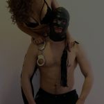 Wear My Kink
Layout: Design
Layout design can make or break your page. If you want a page that converts browsers into subscribers you need layout design that guides the eye and the wallet. The Top OnlyFans Page serves as a gold standard for how a kink content hub should feel with clear navigation and premium visuals that command attention across devices. This article breaks down how to craft a layout that matches your brand voice and supports sustainable earnings. We will cover design philosophy practical grids hero images content thumbnails menus and how to test and iterate. Expect practical examples and real life scenarios you can apply today to your own page.
Why layout design matters for a kinky OnlyFans page
Layout is more than pretty pictures. It is a system that helps fans find the content that excites them and makes it easy to stay engaged. A well designed page communicates boundaries and offers at a glance what a subscriber can expect. The goal is to reduce friction. When a person lands on your page they should instantly feel your vibe and understand where to look next. A strong layout supports storytelling from the moment the user scrolls or taps. It also helps new fans find your best work without feeling overwhelmed by a wall of random posts. You want a design that feels intentional not accidental. Think of your page as a stage where each visual element has a purpose and every click moves a fan deeper into your world.
Core layout design principles for kink content creators
There are a few universal rules that guide strong layouts across different niches including kink content. These principles help you align your design with your content strategy and your audience expectations.
Clarity above everything
Clarity means every component has a clear role. The hero section should tell visitors who you are and what they can expect in a single glance. Navigation should be obvious and predictable. Don t hide prices or content menus behind multiple clicks. Fans should not have to hunt for basic information. A clean header with a visible menu and a concise value proposition sets the tone for everything that follows. When users feel confident they are more likely to subscribe and engage with longer form content like longer videos or weekly collections.
Consistency breeds trust
Consistency is not about sameness it is about a unified look and feel. Use a defined color palette consistent typography and a set of grid rules. This consistency signals that you are a professional creator who cares about quality. It also makes your feed feel cohesive which in turn improves perceived value. If your posts vary wildly in lighting or editing style it becomes harder for fans to trust the quality. A steady approach to thumbnails borders and captions makes a stronger impression and helps fans recognize your content instantly even when they skim through a large feed.p>
Visual hierarchy guides the eye
Your design should guide the viewer from headline to hero to content preview with intention. Use size contrast to draw attention to the most important elements. A bold headline or a bright call to action should sit above a grid of content previews. Secondary actions like signing up for a newsletter or checking out a pricing menu should be clear but less dominant. The viewer should never feel overwhelmed or lost. A clear visual path makes browsing pleasurable and increases the chance that a visitor will convert into a subscriber.
Accessibility boosts engagement
Design for all fans including those with visual impairments. Ensure text contrasts adequately against backgrounds and provide descriptive alt text for every image. Make sure the navigation can be operated with a keyboard. Simple and readable typography helps fans of all ages enjoy your content. Accessibility is not a afterthought it is a core feature of a great design that broadens your potential audience and reduces friction for everyone who wants to enjoy your work.
Mobile first philosophy
Most fans will view your page on a mobile device. A mobile first approach focuses on speed readable text and touch friendly controls. Start with a single column layout for small screens then progressively enhance for larger displays. Larger screens can accommodate multiple columns a richer hero and additional content sections while keeping the same core rules. A mobile friendly design reduces bounce and makes it easier for fans to subscribe while on the go. It also makes it easier to deliver high quality media without compromising load times.
Structure your page like a magazine
A magazine style approach can deliver a premium experience on an OnlyFans page. It uses a strong hero area a grid based content section and a bottom block that invites ongoing engagement. The hero area sets the mood with a compelling image a concise value statement and a clear call to action. The grid below showcases the best content types such as photo sets videos and custom clips. The bottom area can feature highlights a promo or a teaser for upcoming content. By emulating magazine architecture you create an intuitive flow that fans can follow without confusion. The result is a page that feels curated and exclusive rather than random and chaotic.
Hero area and first fold
The hero area is the first thing a visitor sees. It should communicate your niche your mood and your offer in a single glance. Choose a striking hero image or short video that captures the essence of your brand. A strong headline under the hero image should tell visitors what they gain by subscribing. This area must load quickly and look sharp on mobile. Use a bold typography scale that ensures readability even on small screens. The call to action should be obvious and friction free. A typical hero layout includes a large visual element a short supporting sentence and a prominent subscribe button. You can also feature a quick glimpse of the content menu or a teaser clip to whet appetite. The goal is to invite a deeper look without overwhelming the viewer with choices.
Hero image guidelines
When selecting hero imagery prefer close ups that reveal texture color and mood. Consistency in lighting and texture helps viewers immediately recognize your style. If your niche includes stockings leather or latex ensure that the hero imagery reflects those textures with careful lighting. Props should support the mood without distracting from the subject. The hero image should be sized for speed and effect and optimized for mobile in both portrait and landscape modes. A well chosen hero image anchors the entire page and sets expectations for everything that follows.
Call to action and conversion prompts
Conversions happen when fans know exactly what they will get and how to obtain it. A clear subscribe button a succinct pricing outline and a direct invitation to view a sample or a teaser clip can increase click through. Place the main call to action near the bottom of the hero so visitors see context first then action. Secondary prompts such as a link to the content menu or a pinned post can offer additional ways to engage without feeling aggressive. The tone of the prompts should align with your brand voice bold playful and unapologetic while remaining respectful. The aim is to balance desire with clarity so fans feel confident choosing to subscribe.
Navigation and site architecture
Navigation should be easy to parse at a glance. A stable top navigation bar with a few primary items keeps the user oriented. Secondary navigation can live in a side panel on larger screens or in a collapsible menu on mobile. Use labels that align with fan expectations such as Home About Content Pricing and Contact. Within the content area create logical categories or collections that reflect your most popular themes and formats. For example a grid might feature collections such as Classic Hosiery Domination Roleplay and ASMR or any set that matches your niche. When fans can quickly locate the kind of content they want they spend more time on your page and are more likely to convert to subscribers.
Menu structure and categories
Keep the primary navigation concise a short list of categories is enough. You can expand within the content area using sub collections or a drop down style menu. Use consistent naming across all channels to help fans transition smoothly from social posts to your OnlyFans page. A well organized menu reduces cognitive load which makes fans more likely to explore more of your content and to stay longer on your page. When building categories think about how fans think about your work describe content in terms fans recognize and care about rather than internal jargon. The easier you make the search the more engagement you will see over time.
Thumbnail grid and media previews
The grid is the visual heartbeat of your page. Thumbnails should be crisp well cropped and representative of the content. A clean grid helps fans compare options quickly and decide what to click next. Pay attention to aspect ratios keeping a consistent look across the grid. If your content uses horizontal and vertical formats create simple rules to harmonize them visually. Consistency in thumbnail framing improves the perceived quality of your feed and supports faster decision making by fans.
Grid layouts that work
Two popular approaches work well for kink content grids. The first uses uniform square thumbnails to create a neat checkerboard feel. The second uses a balanced mix of wide and tall thumbnails arranged in a grid that creates visual rhythm. The key is to avoid irregular gaps and ensure everything aligns to a precise baseline. When users skim the grid they should experience a steady cadence of color and texture that invites further exploration. A grid with clear borders and light spacing feels modern and premium. It is easier for fans to scan and perceive the range of your offerings.
Thumbnail sizing and borders
Consistent thumbnail size reduces motion and improves readability. Small borders can help separate images without creating visual noise. The border color should blend with the overall color palette so it does not compete with the thumbnails themselves. Ensure thumbnails retain detail even when scaled down for mobile. A thumbnail that looks sharp in large previews should remain legible on small screens. Quality previews are a strong signal of value for fans deciding whether to subscribe.
Pricing menus and content organization within layout
Pricing presentation is part of your design system. A clean layout that presents price points and content types clearly reduces hesitation and supports informed choices. Use a dedicated pricing area that is visually distinct but aligned with the rest of the page. The pricing area can feature a simple monthly subscription price a per view option and a few bundles. Pair the pricing with a short description of what fans will receive in each plan. Visual cues such as icons or color badges can help fans quickly compare options. A transparent approach to pricing fosters trust and makes fans more likely to convert rather than bounce away from the page.
Content menus and delivery expectations
Highlight the formats you offer whether that is photo sets videos live shows or custom clips. Include a short note about delivery times and formats so fans know what to expect. A clear content menu reduces back and forth and helps fans tailor a package that fits their appetite. When a fan understands the options they can craft a plan that aligns with their preferences and budget. A well defined content menu also helps you manage expectations and protect you from scope creep in custom orders.
Brand language reflected in design
Your layout design should reflect the voice you use in your writing and the vibe you create in your media. The typography color and imagery should reinforce the outrageous yet relatable mood you bring to the page. A bold typeface with confident letter sizing communicates strength and clarity. A color palette that nods to leather shine satin and neon can help you stand out while still feeling accessible. Imagery should be chosen to emphasize texture and mood rather than overcrowding the frame. The way you layer text over imagery matters. Keep contrast high enough for readability and avoid covering the most important visual details with text blocks. The right balance makes the page feel refined and genuinely on brand.
Typography choices
Choose a primary font for headlines that feels strong and distinctive. A secondary font should be used for body text and menu items to ensure readability. Keep font sizes consistent across sections and use line height that keeps text easy to read on small screens. Avoid too many font families that can create a busy look. A clean typography strategy improves legibility and helps fans move through your content with confidence. When fonts are well chosen the page reads like a confident magazine rather than a random collection of posts.
Color palette and mood
Color supports emotion. A palette that includes a bold primary color a darker tone for depth and a bright accent for call to action can create a dynamic visual experience. Consider how your color choices interact with your photography and video lighting. Color should enhance legibility and guide attention rather than overwhelm. A well tuned palette aligns with your subject matter and makes the experience feel premium. The right color scheme gives a cohesive mood that fans will recognize across posts and promotions.
Accessibility and inclusivity in design
Think about fans with different abilities and different devices. High contrast text helps readers with visual impairment. Alt text for images should describe the content succinctly for screen readers. Focus visible outlines on interactive elements when users navigate with a keyboard. Ensure the page remains fully navigable when images fail to load. An accessible design reaches more fans and shows that you care about their experience. It also prevents frustration that could derail a potential subscriber during the critical discovery phase of your page.
Mobile first design and practical tips
On a phone the hero area is often the most important element because it is the first thing a mobile user encounters. Achieve a strong impression with a high impact image or video that loads quickly. The headline text should be readable without zooming in. The main call to action should remain accessible and large enough to tap easily. Below the fold your grid should adapt to a tidy one column flow that becomes a two column arrangement on tablet and a three or four column grid on large screens. The aim is to maintain visual rhythm while preserving fast load times across all devices. A smooth mobile experience keeps fans engaged and reduces the chance they abandon before subscribing.
Content testing and iteration
Design is a living process. Test changes to your layout using playlists of content and observe how fans respond. Small adjustments can yield meaningful improvements in engagement and conversions. For example you can try a slightly larger hero image a different color accent for the call to action or a reordered content grid. Track metrics such as click through rate average session duration and the percentage of visitors who subscribe after viewing the hero. Use these insights to refine and evolve your page gradually. Consistent testing keeps your page fresh and aligned with fan preference while staying true to your brand.
Real life scenarios you can apply today
Imagining real cases helps. Here are two scenarios that illustrate how design decisions affect outcomes. Use these as templates to shape your own page strategy.
Scenario one a new creator designs a polished hero and a simple grid
Situation You are launching a new page and you want a refined elegant look with a straightforward grid. You aim for a premium mood that communicates quality without complexity. Your plan is to use a large hero image a clear value statement and a few content previews organized in a neat grid. You want fans to understand what you offer right away and to feel compelled to subscribe after a quick look. The design must scale down for mobile without losing impact. The hope is that a clean layout encourages fans to explore and commit.
Sample approach Begin with a bold hero image that emphasizes texture like a glossy hosiery shot or a leather ensemble. Add a short but evocative headline that conveys a unique angle of your work. Place the primary call to action directly under the headline. Keep the content grid tight with four to six previews that highlight your strongest formats. Use subtle borders and generous spacing to separate items while preserving a cohesive feel. Ensure the color palette reinforces the mood and keeps the page readable in bright sun or dim studio light.
Scenario two a mature page that wants to push a subscription upgrade
Situation You already have a growing audience and you want to present a more premium tier. You plan a redesigned hero a dedicated pricing block and a featured content carousel that showcases exclusive posts. You also want a visible path to a private live show with a simple booking step. The main challenge is presenting the upgrade as a natural progression that fans can see as their next step without pressuring them too hard.
Sample approach Use a hero with a striking image that communicates exclusivity. Include a brief note about what higher tier subscribers gain such as early access longer clips or custom requests. Create a pricing table that is clean and easy to scan with clear call to action buttons for each plan. Add a small carousel of premium content at the bottom of the fold so fans get a preview of the exclusivity they will access. Ensure navigation makes the upgrade process intuitive and unobtrusive while maintaining your brand tone.
Common mistakes designers make and how to avoid them
Even seasoned creators slip up with layout issues. Here is a quick guide to common missteps and practical fixes. These tips help you avoid cheap looking or hard to navigate pages.
- Overloading the hero with text Replace with a concise message that supports your image and leads fans to the next step.
- Complicated navigation Fans should be able to reach key actions within two taps limit the menu to a handful of items.
- Inconsistent image quality Use uniform image proportions and color grading to keep the grid cohesive.
- Poor color contrast Improve readability by ensuring text stands out clearly against images and backgrounds.
- Slow loading media Compress files and use modern formats to keep load times short especially on mobile.
Ethical design and sustainability in mind
Design decisions should support the creator ecosystem and the fans who invest their time and money. A good layout helps fans discover content they love and keeps them engaged over the long term. This is not about chasing trends it is about building a reliable experience that respects boundaries and promotes ongoing support. Create a design that makes fans feel valued and that reflects your commitment to delivering high quality content. When fans feel respected they are more likely to become loyal subscribers who participate in live sessions and tip for value delivered.
Gear and terms explained so you do not look like a clueless mess
Understanding design terms helps you communicate effectively with any designer or creator you collaborate with. Here is a quick glossary you can rely on as you discuss layout decisions.
- Hero area The top section of a page that immediately captures attention through imagery and messaging.
- Grid A structured arrangement of content previews that creates visual rhythm.
- Call to action A button or link that invites a specific action such as subscribing or viewing more content.
- Contrast The difference between colors or luminance that improves readability and emphasis.
- Accessibility Practices that make content usable for fans with different abilities and devices.
- Typography The choice of fonts sizes and spacing used to present information clearly.
FAQ
How should I choose a hero image for my page
Pick an image that communicates your niche and mood and avoid clutter. The image should look sharp on mobile and reflect the textures your fans expect such as hosiery leather or satin. A strong hero sets the tone for the entire page and gives fans a reason to explore further.
What makes a good content grid for an OnlyFans page
A good grid presents content variety in a consistent frame. Use a balanced mix of previews that highlight the formats you offer. Keep thumbnail sizes uniform and ensure the grid remains legible on mobile. A tidy grid helps fans compare options quickly which supports better conversion rates.
How can I improve accessibility on a visual heavy page
Use high contrast text ensure images include alt text and provide meaningful descriptions. Make sure the site can be navigated with a keyboard and that focus indicators are visible. These steps improve the experience for fans who rely on assistive tech and they reflect well on your professionalism.
What is the best way to test new layout changes
Test changes one at a time and measure impact on engagement and subscriptions. Use simple experiments such as adjusting hero text color swapping a hero image or resizing the CTA. Track metrics like click through rate and conversion rate to decide whether to keep the change or revert it.
Do I need a dedicated pricing page or is a small pricing block enough
A dedicated pricing area helps fans compare plans at a glance. It reduces friction by making the options clear and easy to understand. A well designed pricing section supports informed decisions and increases the likelihood of subscription upgrades.
Plan a regular refresh cycle. Align updates with changes in your content strategy and fan feedback. Small iterative improvements keep the page relevant without alienating long time fans. Maintain a balance between consistency and novelty to preserve brand identity while inviting renewed interest.
Explore Popular OnlyFans Categories
Amateur OnlyFans
Anal
Asian OnlyFans
BDSM
Big Ass OnlyFans
Big Tits OnlyFans
Bimboification
Bisexual OnlyFans
Blonde OnlyFans
Brunette OnlyFans
Cheap OnlyFans
Cheerleading Uniforms
College OnlyFans
Cosplay
Cuckold
Deepthroat OnlyFans
Dick Rating OnlyFans
E Girl OnlyFans
Ebony OnlyFans
Exhibitionism
Feet
Femboy OnlyFans
Femdom OnlyFans
Fetish Models
Foot Worship
Goth
Hairy OnlyFans
JOI OnlyFans
Latex
Latina OnlyFans
Lesbian OnlyFans
Lingerie
Massages
Milfs
No PPV
OnlyFans Blowjob
OnlyFans Couples
OnlyFans Streamers
Pegging
Petite OnlyFans
Piercings
Pornstar
Skinny
Small Tits
Squirting
Swinging
Tattoos
Teacher OnlyFans
Teen
Thick
Trans
Yoga OnlyFans
18 Year Olds On OnlyFans
Oh and if you're looking for our complete list of the best OnlyFans accounts by niche, fetish and kink...check this out: Best OnlyFans Accounts
Oh and...check out some of the latest bits of press on us: Press Releases & Articles